Posted on 03-03-13 02:23 pm

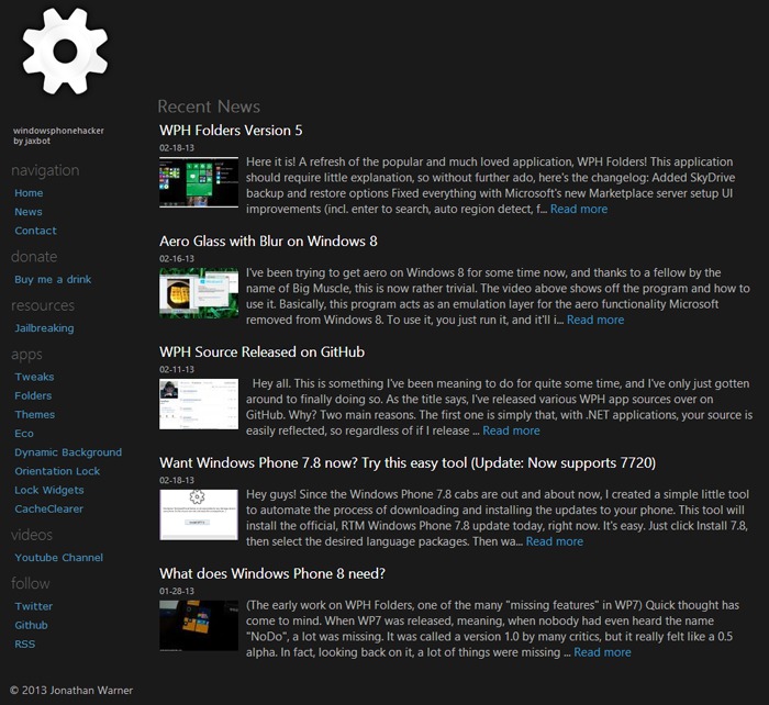
It's been a while since I pushed a major change to the WPH site design, though I've spent time on and off over the last few months making performance enhancements. Today, I've pushed the new site design I've been working on, with hopes that it will bring a fresher look to the dated WPH design.
If we want to look at the site update the same way my literature master evaluates dead trees, the new design represents the shift I'm making to put WPH in a more open, more transparent mode of operation, as seen with the lack of borders around the content frame.
The dark theme also contrasts against Microsoft's traditional style for Metro, showing the anti nature of WPH towards bending the platform to our own wills, rather than Microsoft's.
Or, we can just accept that WPH needed a new design and this is what happened. I'm open to all suggestions, and will be making tweaks here and there throughout the next few weeks as I see fit. If you experience any problems with the change, send me line and I'll see about getting it fixed.
Enjoy! ~Jaxbot
