Posted on 11-05-12 04:43 pm
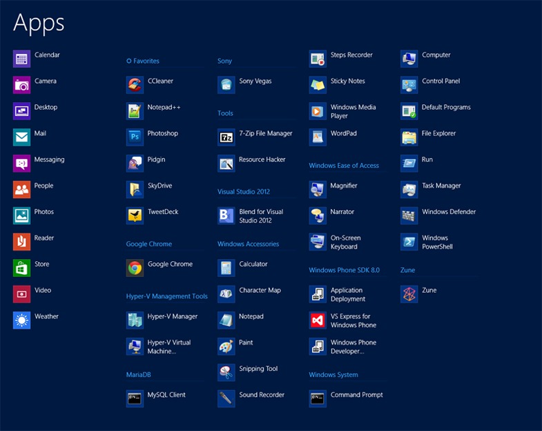
A thought occurred to me this morning: the Windows 8 Apps screen, while very functional and especially good for searching, is extremely cluttered. If you're not getting what I mean, take this for example:
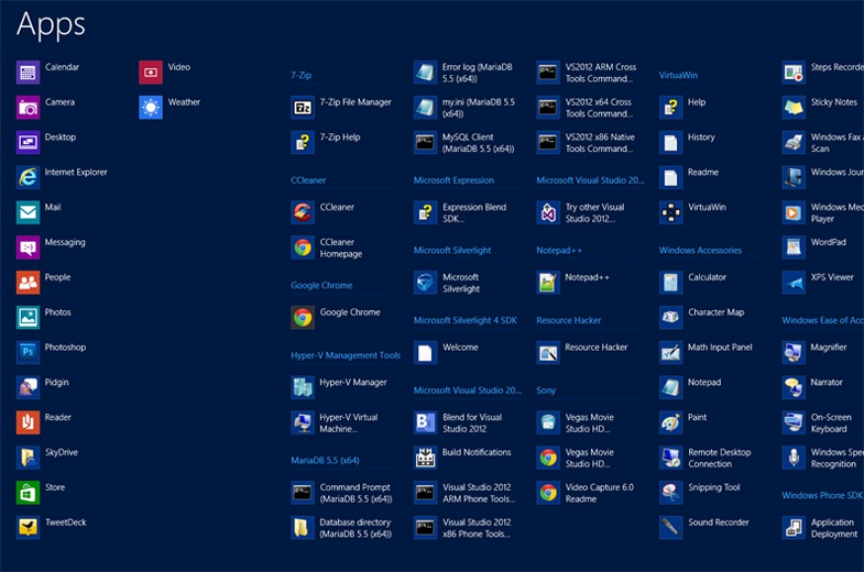
This is my apps list prior to organization. It includes all the contents of what would be in a start menu, and organizes them alphabetically. Useful, but many of these links will never, ever be touched, and they include ambiguous icons such as "Help" and "Readme". Certainly not helpful.
Despite the fact I rarely look at the screen for more than a few milliseconds when typing an apps name, I figured it could use some cleaning up. So here's what you do:
1. Open up the apps list, and right click on any program (not an app)
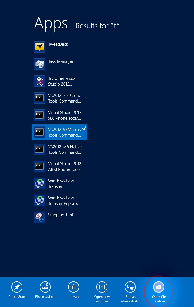
This will bring up the little bar on the bottom.
2. Click on "Open file location"
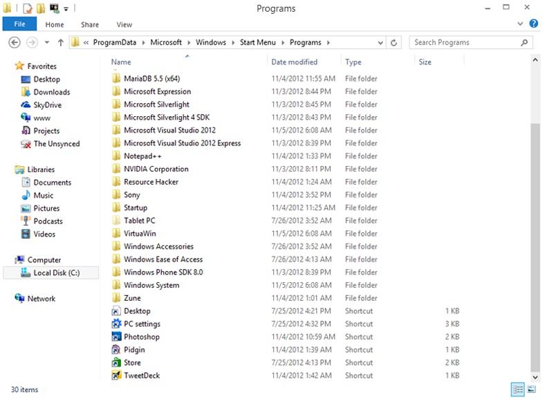
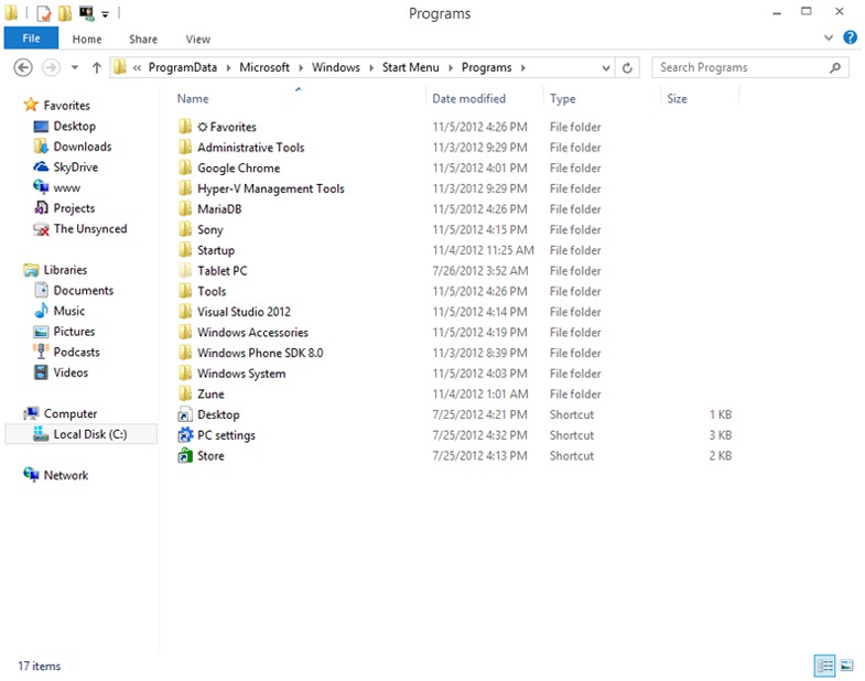
This will take you to the Start Menu folder, where you can see all the folders and their shortcuts. Keep in mind that there are actually two start menu folders, one for the user and one for the system. You can access the system one by right clicking on something such as Paint, and the user one by right clicking on most other programs.
Here's what it should look like:
3. Organize those folders
From here, the process is simple. The top level folder name, such as "Zune", represents the category name on the apps list. The shortcuts within the folder are sorted alphabetically. You cannot nest categories.
Personally, I took the liberty of removing all unneeded shortcuts, and then merged folders and created others. In the end, the folder looked something like this:
If you do not see your changes immediately, sign off and back in.
My final result looked something like this:

Much cleaner.
Any questions? ;)
