Posted on 11-01-12 06:04 pm

When I began using Windows 8, I immediately encountered a problem with the RTM build. Well, not really a problem, more like a distaste. Love or hate Metro, the desktop styles have been striped of their glass, something I'm not a fan of. Sure, glass probably wastes battery life, but I'm on a desktop here, and would really enjoy the choice of having it. Oh well, that's a project for another day. But at least the desktop matches the flat, Metro appearance, right?
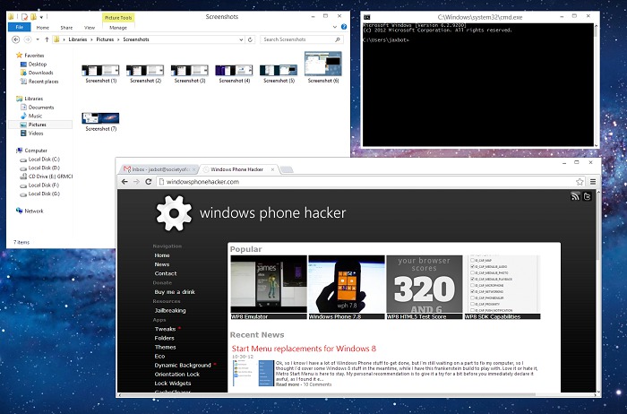
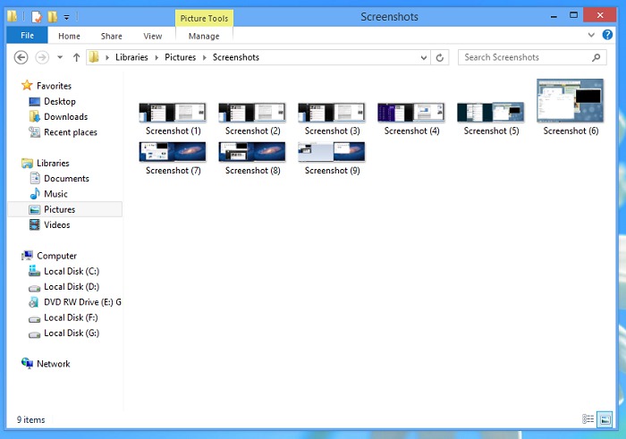
Well, yes, but in my opinion, Fisher Price should not be used to take cues about color schemes:

This is one of the better examples. Blue, Purple, Pink, Yellow, whatever the color, they all suffer from a giant, maroon colored exit button. Nothing goes with maroon, except maybe white. And the inactive styles are a flat gray. If Microsoft's goal is to get people off the desktop, they're doing it the wrong way.
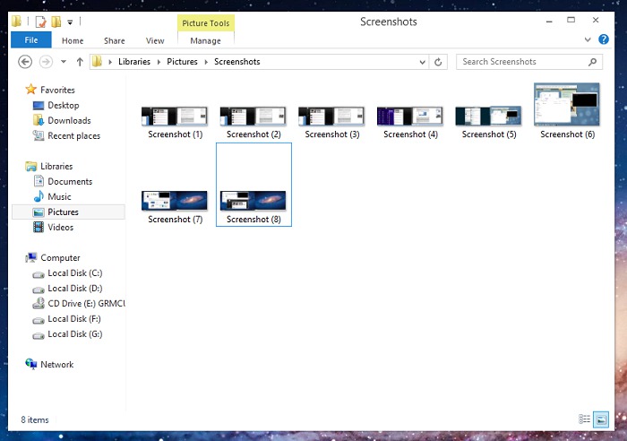
Fortunately, there happens to be a very easy fix, one that I consider quite pretty:

That's the same window from above, but focused. It's flat, Metro-y, and looks decently clean. And having a clean desktop is important when you use your desktop for completing vital, concentration requiring work. And it's all thanks to a theme I happened to stumble upon (not an allusion) from DeviantART user Seahorsepip. It's the Minimal theme, which is a light-weight UX style for Windows 8 that reminds me of the Zune application.
Another similar example, for people wanting a little less flatness, is the TwentyThirteen theme.
So, how exactly is this possible? Well, Rafael Rivera, who happens to be rather well-known around the Microsoft fan community, has a project known as UXStyle. Simply put, this allows installing unsigned, unofficial visual styles to Windows 7 and Windows 8. Obviously, since Windows 8 has just come out, the amount of available visual styles is limited. But regardless of this, work is already being done by designers and artists who enjoy sharing, and as such, my pet peeve of having toy-colored desktop windows has been easily solved.
Any thoughts, questions, concerns? As with everything, I believe we should have a choice, regardless of whether or not we appreciate it. Big thanks to Rivera and the artists of these themes, too.
